LinkedIn Post Format: Specs, Layout and 6 Templates
How to format a LinkedIn post: the 3,000-character limit, the "see more" cut, line breaks, bold text, image sizes and six announcement templates.
The short answer
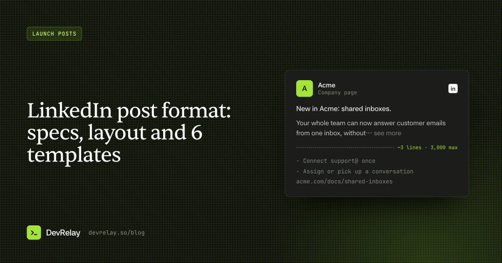
A LinkedIn post is plain text with line breaks, up to 3,000 characters, plus one kind of attachment: photos, a video, a document, a poll or a link preview. Put the news in the first line (about three lines show before "see more"), keep paragraphs to one to three sentences with blank lines between them, use Unicode bold for a few words at most, and use 1,080 px wide images between 3:1 and 4:5.
Key takeaways
- The first line carries the post: about three lines show before "see more", so say what changed there.
- LinkedIn keeps line breaks but has no formatting; bold and italic are Unicode characters with accessibility costs.
- Photos: 1,080 px wide, between 3:1 and 4:5; 1,080 × 1,350 is the tallest. Link preview images: 1,200 × 627.
- For an announcement, 100 to 250 words and a link to the docs or changelog beat a 3,000-character post.
A LinkedIn post is plain text with line breaks, up to 3,000 characters, plus at most one kind of attachment: photos, a video, a document, a poll or a link preview. That's the whole format. What makes one post get read and another get scrolled past is how you use those few pieces: the first two or three lines, where the line breaks go, and whether the image fits the feed.
This guide covers both halves. First the specs, checked against LinkedIn's own help pages: character limits, the "see more" cut, image sizes, link previews and document posts. Then the layout: how to structure a post, how to fake bold text (and when not to), hashtags, links, and six templates for product and feature announcements with worked examples.
LinkedIn post format at a glance
These are the limits that matter when you format a post. The numbers come from LinkedIn Help, as of October 2026; the "see more" cut is the one LinkedIn doesn't publish, so it's an estimate.
| What | Limit or spec |
|---|---|
| Post text | Up to 3,000 characters. Longer than that, LinkedIn suggests writing an article instead |
| "See more" cut | Not published by LinkedIn. About three lines: roughly 210 characters on desktop, 140 on mobile, fewer if you add line breaks |
| Formatting in the post box | None: no bold, italic, headings or lists. Line breaks are kept |
| Photos | At least 552 × 276 px, 1,080 px wide recommended, aspect ratio from 3:1 to 4:5, up to 5 MB each, up to 20 per post |
| Photo file types | JPEG, PNG, WebP and GIF on desktop and mobile |
| Link preview image | At least 1,200 × 627 px, ratio 1.91:1, up to 5 MB. Images under 401 px wide show as a small thumbnail |
| Documents (carousels) | One per post, PDF, PPT, PPTX, DOC or DOCX, up to 100 MB and 300 pages |
Sources: LinkedIn Help pages on posting updates, sharing photos, media file types, document uploads and making a website shareable on LinkedIn.
How long should a LinkedIn post be?
The limit is 3,000 characters, which is roughly 450 to 500 words of English. You'll rarely want all of it. For a product announcement, 100 to 250 words is enough to say what changed, why it matters and where to learn more; more than that and you're writing the release notes inside the post. Put the full detail on your changelog or docs page and link to it.
Length matters less than the first lines, because most readers decide whether to expand the post from what they see before "see more".
Write for the "see more" cut
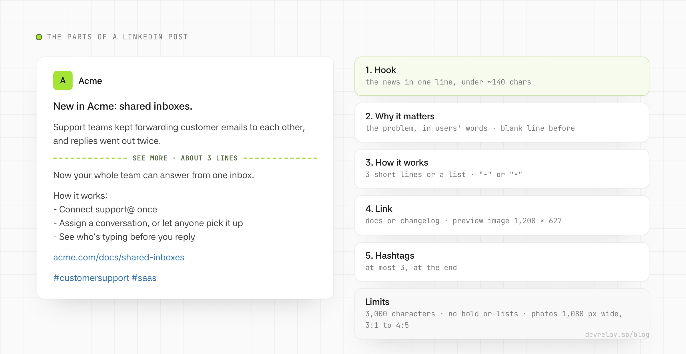
LinkedIn shows the first few lines of a post in the feed and hides the rest behind "…see more". The cut is about three lines, so where it falls depends on the reader's screen width and on your line breaks: a post that opens with three one-word lines is cut after three words.
Three rules for the first lines:
- Put the news in the first line. "New in Acme: shared inboxes." is a complete thought even if nobody expands the post.
- Keep the first line under about 140 characters so it survives the cut on a phone.
- Follow it with a blank line. The gap makes the opening read as a headline, and the second line becomes the reason to click "see more".
Don't open with a question you answer three paragraphs later, or with "I'm thrilled to share". The reader can't see the news yet, so they have no reason to expand it.
To check where the cut lands before you post, paste your draft into the LinkedIn text formatter: its preview shows what readers see before "see more" on desktop and on mobile.
Line breaks and spacing
LinkedIn keeps the line breaks you type, including blank lines, so spacing is your main layout tool:
- One idea per paragraph, one to three sentences each. On a phone, a five-sentence paragraph is a wall of text.
- A blank line between paragraphs. LinkedIn doesn't add space between lines on its own.
- No decorative spacing. Rows of dots, lines of single words or a blank line after every sentence make the post longer without making it clearer, and push your link below the fold.
If you draft in a doc or a notes app, check the post after pasting: some editors turn blank lines into nothing when you copy.
Bold, italic and lists on LinkedIn
The LinkedIn post box has no formatting buttons. The bold and italic text you see in posts is made of Unicode characters, the mathematical bold and italic letters, which look styled but are different characters from normal letters. You make them with a converter, such as our LinkedIn text formatter, and paste them in.
That trick has costs, so use it for a few words at most:
- Screen readers may spell styled words letter by letter, announce them as math symbols or skip them.
- Search doesn't match them. A product name in Unicode bold won't be found when people search LinkedIn for it.
- They don't always render. Some fonts and older devices show boxes instead.
Never style a whole sentence, a link, a hashtag or your product name. A short label at the start of a line ("Before:", "Now:") is the most bold a post needs.
For lists, type a hyphen or a bullet character (•) at the start of each line. Numbered lists work the same way with "1." and "2.". Keep lists to three to five items; a longer list belongs in the linked page.
Articles and newsletters are different: they have a rich-text editor with headings, bold, lists and embedded images. If your announcement needs subheadings, it's an article, not a post.
Emoji, hashtags and mentions
- Emoji: one can help a list scan; five make the post look like a template. In a technical announcement, use none or one.
- Hashtags: put them at the end, and use at most three, chosen for what people actually follow (#saas, #productmanagement), not invented ones (#AcmeLaunchDay). Hashtags in the middle of a sentence make it harder to read.
- Mentions: type @ and pick the person or Page from the list so they're notified. Mention the people who built the feature, or a partner whose integration you shipped. Don't mention people just to borrow their reach.
Links and link previews
When you paste a URL, LinkedIn builds a preview card from the page's Open Graph tags: og:title, og:description and og:image. LinkedIn asks for a preview image of at least 1,200 × 627 px at a 1.91:1 ratio; anything under 401 px wide is shown as a small thumbnail. If the preview shows the wrong title or an old image, fix the tags on your page and refresh LinkedIn's cached copy with its Post Inspector. You can check what a page sends with our Open Graph checker.
Choose one visual per post. A clear preview card is usually enough for a docs or changelog link; attach a photo instead when the screenshot is the news.
Some people put links in the first comment instead of the post. LinkedIn doesn't publish how it ranks posts, so we can't tell you whether that changes reach. We'd keep the link in the post: readers who want to try the feature shouldn't have to hunt for it.
LinkedIn post image size
LinkedIn accepts any photo from 3:1 (wide) to 4:5 (tall), at least 552 × 276 px, and recommends 1,080 px wide. Images outside that ratio are cropped from the centre. Within those rules, three sizes cover almost everything:
| Shape | Size | Use it for |
|---|---|---|
| Portrait 4:5 | 1,080 × 1,350 px | The tallest LinkedIn allows, so the most space in a phone feed. Feature graphics, a key number |
| Square 1:1 | 1,080 × 1,080 px | Logos, quote cards, simple before-and-after images |
| Landscape 1.91:1 | 1,200 × 627 px | Screenshots of wide UI, and the same image as your link preview |
Keep text on the image large enough to read on a phone, and don't repeat the post's first line on the image: let the image show something the text can't, such as the screenshot or the number.
Document posts (carousels)
The "carousel" posts you see on LinkedIn are usually document posts: a PDF (or PPT, PPTX, DOC, DOCX) shown as swipeable pages. You can attach one document per post, up to 100 MB and 300 pages. Use the same page size throughout and make the first page work as a cover, because it's what shows in the feed.
A document post suits a step-by-step walkthrough of a feature, five to ten slides, one idea per slide. It's too much for a fix or a small improvement; use text and a link for those.
LinkedIn post templates for product announcements
The structure below works for most announcements: the news in one line, why it matters, how it works in a few short lines or a list, then the link. The six templates adapt it to the kind of update. The examples use Acme, a made-up help desk product; copy the structure, not the claims.
1. Feature launch
Use when you ship something new that users will notice.
New in {Product}: {the feature, in plain words}.

{The problem it removes, in one or two sentences, as users describe it.}

{What they can do now, in one or two sentences.}

How it works:
- {step or detail 1}
- {step or detail 2}
- {step or detail 3}

{link to docs or changelog}

#{tag1} #{tag2}
New in Acme: shared inboxes.
Support teams kept forwarding customer emails to each other, and replies went out twice or not at all.
Now your whole team can answer from one inbox, and everyone sees who's on each conversation.
How it works:
- Connect support@ once
- Assign a conversation, or let anyone pick it up
- See who's typing before you reply
acme.com/docs/shared-inboxes
#customersupport #saas2. Why we built it
Use when the person who built the feature posts it in first person. It works best for features that came from customer requests.
{Number or kind of} customers asked us for {thing}. Here's why it took us {time} and what we built.

{The users' problem, in their words.}

{What we built and what it lets them do, in two or three sentences.}

{One honest sentence about a trade-off or what's next.}

{link}
3. Several changes in one update
Use when a release has two or more changes worth naming. Lead with the biggest one; don't give them equal weight.
New in {Product}: {the headline change}.

{One or two sentences: what users can do now and why it helps.}

Also new:
- {change 2}
- {change 3}

{link to the changelog}
New in Acme: shared inboxes.
Your whole team can now answer customer emails from one inbox, without forwarding threads around.
Also new:
- Snooze any conversation until the time you pick
- Search is faster in large inboxes
acme.com/whats-new4. A fix users felt
Use for a bug fix or improvement that annoyed enough people to deserve a post. Lead with the symptom they saw, not the cause.
{The symptom, as users saw it}: fixed.

{One sentence: what was happening and who it affected.}

{One sentence: what happens now.}

Thanks to everyone who reported it.

{link}
5. Breaking change or deprecation
Use when users have to do something. Say what changes, when and the one step to take, before anything else.
Heads-up: {what changes} on {date}.

Who's affected: {who}.

What to do: {the one step}.

{Why we're making the change, in one sentence.}

{link to the migration guide}
6. Spotlight on an existing feature
Use for a feature people already have but don't use. Don't present it as news; present it as a tip.
{A task your users do often}? {Product} can {do it for you}.

{How people use it, in two or three sentences or a short list.}

{link to the docs}
For the X version of the same announcement, see how to announce a release on X: ten post formats matched to the kind of change. The two posts shouldn't be the same text; LinkedIn has room for the why.
Checklist before you post
- The first line says what changed and is under about 140 characters.
- A blank line follows the first line, and no paragraph is longer than three sentences.
- The post is under 3,000 characters, and for an announcement, under about 250 words.
- Any Unicode bold is a few words at most, and never your product name, a link or a hashtag.
- The link goes to the docs, changelog or feature page, and its preview shows the right title and image.
- Images are 1,080 px wide (or 1,200 × 627 for a link-style image) and readable on a phone.
- At most three hashtags, at the end.
- Every claim is true of the product people can use today: it's released, and any number was measured.
How DevRelay writes LinkedIn posts
DevRelay drafts LinkedIn launch posts from what your team actually ships. It watches your GitHub repositories, waits for the release, and picks a LinkedIn format by the kind of update: a story post (the problem before how it works, 120 to 220 words, short paragraphs, at most three hashtags at the end), a "what's new" post for a release with several notable changes, a first-person "why we built it" post, a spotlight on a feature users already have, and a weekly roundup of what shipped.
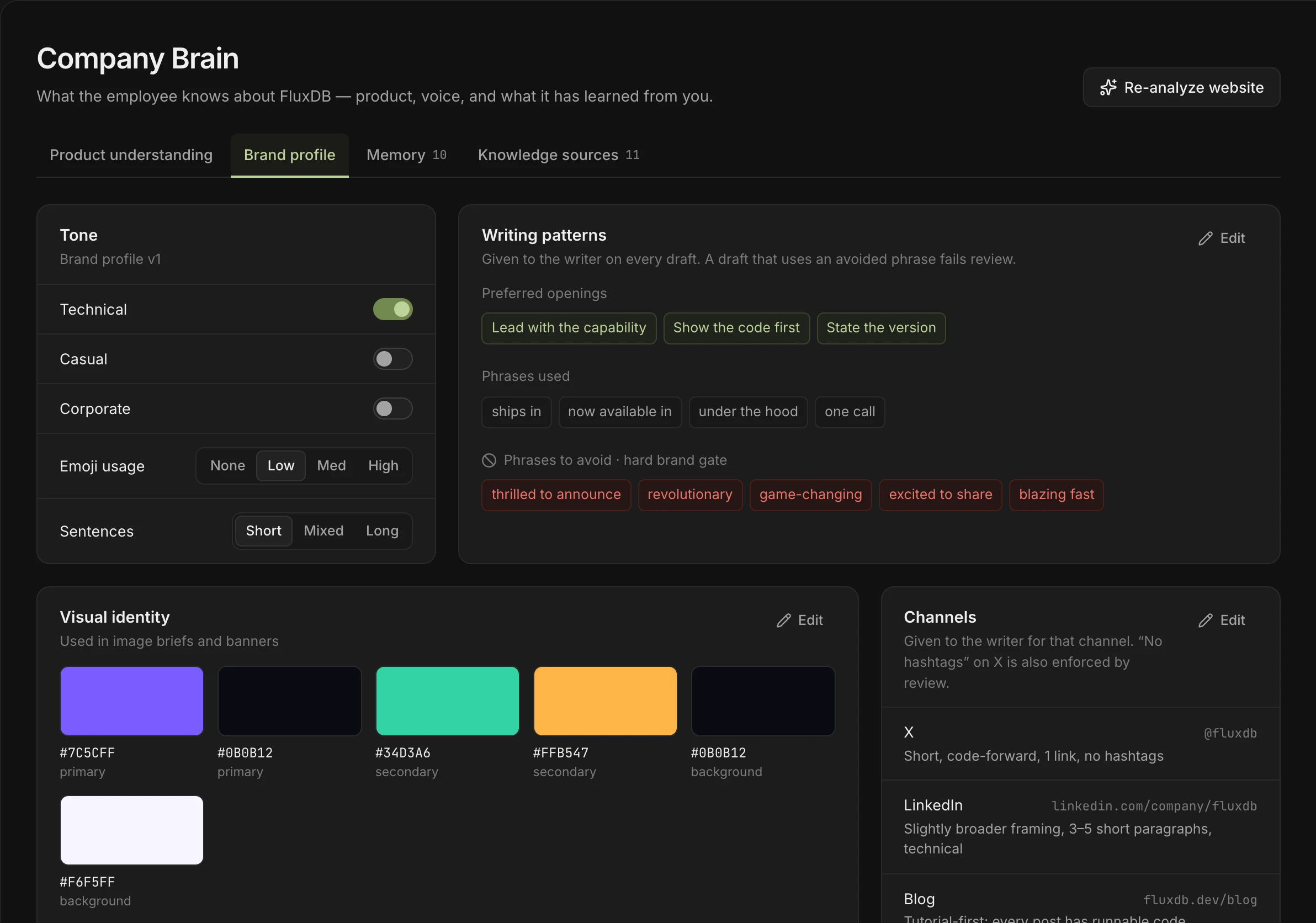
Drafts are plain text: no markdown, which LinkedIn would show as literal asterisks and brackets, and URLs pasted as they are. Each draft is written in the voice and channel guidance in your company Brain, every claim is checked against the release and your docs, and nothing is posted until you approve it. Once approved, DevRelay posts it to your connected LinkedIn account, with the launch image if you approved one, now or at a time you pick.
To try the idea on one change, paste a pull request into the free PR to LinkedIn post generator, then check the hook with the LinkedIn text formatter.
Frequently asked questions
What is the character limit for a LinkedIn post?
3,000 characters, according to LinkedIn Help. If you need more, LinkedIn suggests writing an article instead. Only about the first three lines show in the feed before "see more".
How do you format text in a LinkedIn post?
The post box keeps line breaks and blank lines but has no bold, italic, headings or lists. Use short paragraphs separated by blank lines, hyphens or bullet characters for lists, and Unicode bold from a converter for a few words at most.
What is the best image size for a LinkedIn post?
LinkedIn recommends images 1,080 px wide with an aspect ratio between 3:1 and 4:5. In practice: 1,080 × 1,350 (4:5 portrait) for the most space in the feed, 1,080 × 1,080 for square images, and 1,200 × 627 for landscape images and link previews.
Where does LinkedIn cut off a post with "see more"?
LinkedIn doesn't publish the exact cut. It's about three lines, roughly 210 characters on desktop and 140 on mobile, and fewer if your opening uses line breaks. Keep the first line under about 140 characters.
How many hashtags should a LinkedIn post have?
No more than three, at the end of the post, chosen from tags people actually follow. Hashtags in the middle of sentences make the post harder to read.
How do I make a carousel post on LinkedIn?
Upload a document: a PDF, PPT, PPTX, DOC or DOCX of up to 100 MB and 300 pages, one per post. LinkedIn shows its pages as swipeable slides. Make the first page work as a cover.